

Purple Between Blue and Red: The Art and Psychology of Purple
The Colour That Lives Between Worlds
Have you ever noticed how purple feels different from other colours? It’s not quite the calm of blue, yet it’s not the intensity of red either. Purple lives somewhere in between, like a deep breath that holds both stillness and energy.
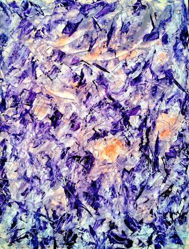
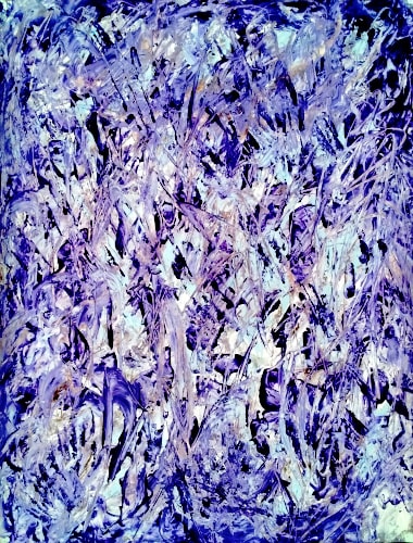
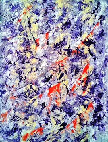
In my latest oil painting series, Purple Between Blue and Red, I’ve been exploring this fascinating colour and what it does to our minds and emotions. I want to share with you the incredible psychology of purple and how this unique hue has the power to balance our inner world.
What You’ll Discover About the Psychology of Purple
Throughout this blog, you’ll uncover:
- The fascinating science behind purple colour psychology and why this hue can make you feel both calm and energised
- How I’ve layered and blended purples in my paintings to express complex emotions and inner tension
- A personal story about how painting helped me navigate conflicting feelings
- Practical ways to use purple’s balancing energy in your everyday life
- A simple exercise to deepen your connection with this remarkable colour
Whether you’re passionate about art, love being creative or you’re simply curious about how colours affect our emotions, this journey into the psychology of purple will give you fresh insights and inspiration.
The Science Behind Purple Colour Psychology
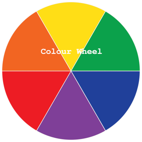
On the colour wheel, purple sits perfectly between blue and red. As a secondary colour, it’s created by mixing a calm, stable cool tone with a bold, energetic warm tone.
This combination gives purple its unique personality, it can feel meditative one moment and invigorating the next.
The psychology of purple reveals something quite remarkable: this colour stimulates both sides of our brain. It engages our creativity whilst encouraging calm reflection. This neurological balance explains why purple is often linked with deep thinking and emotional complexity.
Purple Through History
Did you know that the secret of creating purple was first discovered in a rare Mediterranean sea snail? This fascinating origin story helps to explain why purple became so deeply connected with power, royalty and mystery.
Purple has carried powerful meanings throughout history:
- Royalty and luxury: In ancient times, purple dyes were incredibly rare and expensive worn only by kings and queens
- Spirituality and mystery: Often connected with the mystical and divine, purple evokes depth and the unknown
- Creativity and transformation: As a blend of opposites, purple suggests change, innovation and imagination
Famous artists have long understood purple’s power. Mark Rothko’s No. 6 Violet, Green and Red (1951) and No. 3/No. 13 (1949) with their deep violet fields draw viewers into contemplative states, whilst Georgia O’Keeffe’s purple iris paintings like Purple Petunias (1925) demonstrate how violet hues can convey both intimacy and transcendence.
These examples show how the psychology of purple invites us to dwell in emotional complexity, the very space I sought to capture in my series.
How the Psychology of Purple Creates Emotional Balance
Blue, on its own, speaks of still water, distant horizons and quiet thoughts. Red pulses with heat, its movement, urgency and desire. When you combine them, you don’t just get a colour, you get a conversation between energies.
Purple is the bridge, the middle ground where neither side wins, but both are beautifully present.
A Personal Moment with Purple
During the creation of this series, I found myself caught between two very different feelings. A quiet sadness and an intense surge of hope. I remember mixing a deep violet on my palette, trying to capture that delicate balance.
As I layered cool, calming blues with strokes of fiery red, I felt the painting breathe alongside me. It was as if purple became a mirror to my own experience of holding conflicting emotions at the same time – grief and resilience, stillness and movement.
That moment taught me something essential: it’s perfectly okay to exist between extremes, to carry both calm and passion without needing to choose.
The psychology of purple gave me a language to express that unspoken space we all sometimes inhabit.
My Creative Process: Exploring Purple Colour Psychology
When I began this series, my goal wasn’t simply to “paint in purple” but to explore its entire spectrum. I mixed violets leaning towards blue for calm passages and magenta-rich purples to suggest warmth and movement.
Working with oils, purple is particularly rewarding. The pigments can be transparent in one layer and richly opaque in the next, allowing cool and warm tones to overlap without blending into flat colour.
The brushwork mirrored the emotional theme. Some strokes flowed gently, others felt sharp and restless. Together, they captured that sensation of being “between states”, a moment of change that hasn’t yet settled.
Light played a vital role, too. Watching how sunlight shifted the vibrancy of certain purple tones throughout the day reminded me that emotions, like colours, are fluid and ever-changing. This observation deepened my understanding ot purple colour psychology and how our perception shifts with context.
How to Experience the Psychology of Purple as a Viewer
When you look at purple in a painting, try this simple approach:
- Notice whether it feels warmer (closer to red) or cooler (closer to blue)
- Observe how surrounding colours shift mood – purple next to green feels different from purple next to orange
- Ask yourself what emotions surface. Is it calm, excitement, curiosity or all three at once?
Purples invite a slower kind of looking. They reveal themselves over time, just as “in between” moments in life require reflection to fully appreciate. This dynamic interplay lies at the heart of purple colour psychology – how our perception adjusts based on context and shade.
A Simple Awareness Exercise
Try this over the next week: notice purple in your environment – in clothing, nature, art or everyday objects. Keep a small journal of what feelings arise each time you encounter it. You may discover that purple signals different emotions depending on your state of mind, surroundings or the time of the day.
Practical Ways to Use Purple Colour Psychology for Well-being
Purple isn’t just for art galleries. Its unique energy can enhance your everyday life and foster emotional balance.
In Your Home:
- Add purple accents in rooms where you want to blend relaxation with inspiration – think lavender cushions, deep violet throws or purple artwork
- Use soft purples in bedrooms for restful yet creative energy
- Try deeper purples in study spaces to encourage both focus and imagination
In Your Wardrobe
Wearing purple can subtly influence your mood and how others perceive you. It’s often seen as creative, calming and confident – perfect for situations where you want to project both warmth and wisdom.
For Mindful Creativity
Using purple in adult colouring books, watercolour painting or creative journaling can stimulate creativity whilst soothing anxiety. The psychology of purple makes it an ideal colour for meditative art practices.
A Closing Reflection Purple Colour Psychology
For me, Purple Between Blue and Red became more than just a series title – it became a way of thinking about how we navigate the middle ground in our lives. Between calm and passion. Between stillness and change. Between the known and the unknown.
When you stand in that place, you carry the coolness of one side and the warmth of the other. And perhaps, as the psychology of purple suggests, you can hold them both without having to choose.
A Question for You
When you find yourself standing between calm and passion, what colour would you paint that feeling?
I’d love to hear about your own experiences with purple and how colours affect your emotions. Share your thoughts in the comments below.
Further Colour Psychology Exploration
If you’ve enjoyed learning about the psychology of purple, you might find these related posts interesting:
- Wall Art and Colour Psychology – Discover how to choose artwork that enhances your home’s emotional atmosphere
- What Does Your Favourite Colour Say About You – Find out what your colour preferences reveal about your personality


21 August 2025 @ 6:29 pm
Thanks Suhail!
I couldn’t help thinking about all the purple ideas/things that came to mind.
Purple Rain – by Prince,
Deep Purple – the band,
Purple Hat Ladies – friendship club,
The Color Purple – movie,
Purple Haze – by Jimi Hendrix,
The Purple Heart – a US military medal
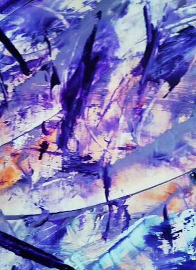
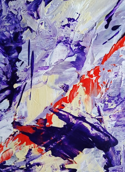
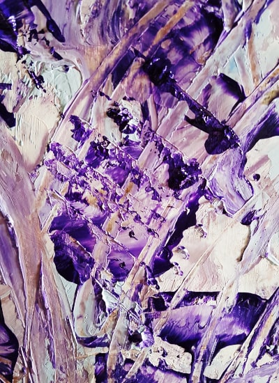
I like the new painting series! For some reason, I especially like the close-ups, maybe because they are a more intimate snapshot of something significant in amongst the whole piece(s).
21 August 2025 @ 6:31 pm
Sorry my six item list collapsed into a single sentence. Feel free to edit it with extra punctuation if desired.
22 August 2025 @ 12:40 pm
Thanks, Don.
Your list made me think of “Purple Cow” by Seth Godin for some reason. I’m not sure why, but it popped into my head.
I agree with you about close-ups. That’s usually how we look at art in real life, we take in the whole piece then zero in on the details that catch our eye.
The close-ups also sparked an idea for my next painting(s). Painting larger individual elements, so they feel like those close-ups, but presented as full works in themselves.
I kept an old sweeping brush (the handle broke off) and I’m tempted to use it as my next tool.
22 August 2025 @ 3:52 pm
The idea for the next paintings sounds great! Using the old sweeping brush – that is what I like about traditional art, one can apply or move paint around with virtually anything and likely get a great look.
22 August 2025 @ 5:27 pm
It’s actually an idea that’s been in the back of my mind for a few months. I just haven’t had the space to turn it into a proper intention yet. My other series have been keeping me busy. But the sweeping brush will have its moment 😊